Monday, November 30, 2009

Crazy Quilt for December!! (already)

Unbelievable that it's already December (in a few hours). I finished this piece last year in October, and, shame on me, I still haven't finished "January."
This is in my "Crazy for Birthdays" series - and the history, etc. of the turquoise and narcissus as symbolism is on my other blog - you can click on Birthday Crazy Quilts to see them all - at least the ones I managed to finish. I'm still short a few, but now am involved with Talavera - and will have to give up sleeping in order to get it all done. It's good to be busy!!

I used some of my favorite special effects on this one - the glitter of the Sundance hexagonal #250 crystal clear beads against the white Petite Very Velvet - looks like ice crystals here. Also, the clear beads - again, #250, but not the hex beads - agains the dark blue PVV looking like rain drops. This is explained on the other blog if you want to go look!

ADDENDUM: The "Crazy for Birthdays" hearts are available as E-patterns on my web page, Elegant Whimsies - downloadable for printing out! Several people have asked.

Wednesday, November 25, 2009

Stitching Talavera: A Basketweave Mini-Tutorial

I've shown this cross on the other blog, as an example of what a difference using Kreinik blending filament can make - and now that I'm stitching it, thought it might be a good one to show a bit of basketweave that seems to confuse people who aren't totally familiar with it yet.

This piece is also the subject of my tutorial on "Creative Needling" a design, as I made a much smaller cross from a big one in my file. Getting started, I rarely paint canvases I'm going to stitch for myself - and especially working on this one with the navy background! Hard on the eyes, it is.


Anyway, the vertical arrow is pointing to where I have the needle inserted, ready to take the next stitch traveling "up the stairs" to the end of the row - worked on the WEFT stitches, which are dips.

The upper arrow demonstrates where I stopped at the angle where the arm of the cross starts, as I couldn't continue downward at that point. I had started stitching in the corner of the arm - the upper right corner, so after traveling up and down for a few rows, it will meet the spot where I stopped stitching.

This way, the row going UP will be one smooth, long row. This is another of the reasons one should ALWAYS adhere to stitching up on the weft, and down on the warp - as two rows going the same direction will look really awful on the surface of the work. You can see this more clearly on the close-up - the cross itself is outlined first with navy Kreinik #12 braid in the 018HL. It looks great against the almost matte finish of the cotton floss (DMC)


I also outlined the design elements with the metallic braid, and then stitched the floss around them - it shows up well!! I didn't do that around the green things, though, as it would have been too busy. Perle cotton (DMC) is used on the red flower, and if you look closely, you can see the Kreinik blending filament twinkling on a few stitches on the yellow and green parts.

I've worked a lot more on this one, and tomorrow, if there's a bit of time, I'll show the result on the other blog - and show what a wonderful thing the blending filament is! Great effects.

Wednesday, November 18, 2009

A "Jeweled" Butterfly in Needlepoint

I rarely get to see any of my designs with the stitching finished - but today I went to borrow one of my Celtic Crosses from the world's finest finisher (here in Austin) - Vikki Pinson. I actually spotted a design I did about ten years ago or more when I was in my binge of adapting antique jewelry to needlepoint all stitched - and stitched so beautifully. What a surprise!!
Anyway, I dug into my files and found the chart I had made for this thing, so thought it might be of interest as a Freebie. I didn't take a picture of the original painted canvas, so this color scheme is a nice surprise! Very pretty, and probably chosen by the lady who stitched it.

To re-create this for yourself, just follow my instructions in previous posts about drawing on canvas - I'm showing two different shots of it on canvas - one with the green leaves outlined to make it easy (also the gold around the jewels). I have no idea what threads she used on it, but it's really sparkly and glittery. I think the background is maybe Kreinik braid #032,, and it's worked in skipped basketweave. This sparkling butterfly is intended for a tree ornament - and I do hope I'll get to see it finished. Vikki will transform it!!

Tuesday, November 3, 2009

Paintbrush Tutorial for "Paint Your Own Canvas"

While painting things I have on order, I decided to go ahead and take pictures as I go, to explain things - pictures are clearer than words in these cases.

I've been amazed to see in several publications the advice to buy cheap paint brushes. This is faulty information, as cheap brushes are difficult to use, time consuming, and downright aggravating for painting on needlepoint canvas.. They wear out so fast one actually spends more in replacing them. I've even seen some that shed bristles!

I use, when I paint on needlepoint canvas with oils (my more serious and traditional designs require it) ONLY fine sable brights, which I purchase through my Dick Blick catalog. (a wonderful book for an artist to go through - I shop in this catalog like my daughters do in J. Crew) In these pictures, I'm using acrylic paint, which my sables don't like - but I'm out of the ones I use normally for painting with acrylics.

I'm illustrating here the fact that when using a good brush in really good condition, one can use a larger brush for several purposes, thereby cutting down on time in cleaning out one brush, putting it down and reaching for another, etc.

This is a #4 size sable bright (NEVER use "shaders" as the bristles are long, so are too soft and flexible to squish the paint well down into the canvas). The picture shows that the brush, well cared for, can actually paint a thin line on just one thread of canvas! Then, turned, it can paint the flat areas as well. - very convenient. As for the flat areas, I do one side in this manner, and then turn the canvas and put the "chisel" edge against the opposite side, as it makes a smooth, clean line against the adjacent area.

The last photo is the finished canvas. I used the Sakura Pen Touch fine line paint pen (gold) for outlining the "pearls." This was a great find for me, as it really cuts down on time spent painting gold outlines with paint and a brush. (and no brush to clean afterward)

This scallop shell is from a series of "Jeweled Sea Treasures" I designed about six years ago. I had discontinued these, but kept the patterns - which is fortunate, as I had an order for several of them from a nice customer whose shop was buying from me then.

The shells in the series were based on actual sea shells, anatomically correct, but I painted them in the bright pastel "Caribbean" colors, and added jewels, which were mostly stitched with Renaissance Shimmer and Sprinkles in smyrna cross and other "bump" stitches.

ADDENDUM: I do have a book on "Paint Your Own Canvas" - which is available in my web store, Elegant Whimsies. It's listed as an "e-book" in two chapters, which you may download and print out yourself at about half the price of the bound book also showing - Just click on "E-Books" under "Our Designs"

Be sure to also click on the "labels" below to see more canvas painting instruction - and also on the other blog, Possibilities, etc.

Sunday, November 1, 2009

Crazy Quilt Heart for November!!

November already! Time does fly, and I need to get the January "Crazy for Birthdays" heart finished, as that will be here soon - I got distracted last year, and stopped in the middle.

Anyway, the colors are so pretty for November - with the gold topaz and the chrysanthemums! The warm "velvet" of the burgundy patch feels fine against the kind of "stormy" blue - and the dark blue with snowflakes or raindrops (Beads)

I looked forward to changing the header and choosing background colors - a great toy!.

This is available as an e-pattern on my Elegant Whimsies site - it's a bit complicated to offer as a Freebie, but the heart outline is here, and this might give you an idea or two.

Friday, October 30, 2009

Halloween Napkin Rings Finished!!

The napkin rings arrived finished - my good friend and great stitcher Pat Miller worked them for me, as I hadn't a clue how to do it myself - I just draw and paint them. Anyway - here they are, and now they are on their way to Oklahoma City for my grandchildren there to enjoy - and their father, who is a child, himself, on Halloween.

The patterns for these, as well as the witch and the bat that I didn't finish painting, are in earlier posts on this blog - for printing and doing them yourself for next year. Actually, the Jolly Roger would do for any little pirate year 'round.
Pat used a lot of Kreinik braid on these, and there are beads on the spider web to look like dew drops - I love the furry scary spider! Her stitching descriptive may be seen on her blog: Needleartnut

Wednesday, October 21, 2009

Creative Needling the Painted Canvas

My dear friend Inge Wooley, with whom I've done business and collaborated for most of the last 37 years, was here visiting her daughter over the weekend - and we had a wonderful visit! Quite refreshing it was, as we did our usual discussions about what we're doing now and going to do in the future, and laughing about the times we had when we first met (accidentally in 1972) and started what became Creative Needle, a line of painted canvases that remains well respected among the timeless and traditional genre of design.

However, I've been trying hard to drag her into the 21st century and see the wisdom in producing some smaller, fun, and less expensive pieces that there aren't enough of out there - mainly because I want to turn over to her my new little Talavera crosses.

She chose three - and we started doing what we call "creative needling" - so I thought it might be interesting to share this process, so you can see what's involved in getting canvases ready to produce and market - and help people understand why the painted canvases are expensive.
She liked the one in the first photo, but the other two are the smaller, six inch crosses, so we had to manage to "creative needle" this one to make it fit. This is a process of making whatever changes need to be made to make the design easier and faster to put onto canvas, thereby keeping the cost down.

Things have to be considered, like the time it takes to draw and then paint them, as hired help has to be paid - and colors and general "feeling" have to be maintained.

The first thing that had to be done was to make this one smaller - down to the 6". (it ended up being 6 1/4", but that's fine). So - first I made a tracing with a black felt pen on tracing paper of the outline of the 6" cross pattern.

Then, I placed this over the big one, and traced the elements of design - and also cut down on the amount of diaper pattern showing, as it takes time to count and paint that. This is a rough tracing, but all that's necessary for this step.

Then, I moved a few things around, and made a better, smoother tracing, and placed the canvas over it and started drawing. I copied the counted symmetric elements from the original - as the lotus looking things on the shaft, and the red flower. I ruined several before I got it like it needed to be. (Hopefully I can stitch this one).

The drawing on canvas looks light, as I don't intend to paint it for myself - I rather like stitching on the white canvas, like a coloring book. Also, I'm too lazy to paint one just for me.

Anyway, basically, "creative needling" simply means taking one of my designs and eliminating what doesn't have to be there, and making it more feasible for mass production. Some things simply aren't worth it, as the resulting price would be too high by the time it got to a retail store..

I have one big Talavera pillow and one big Imari design that I absolutely love, but I cry and threaten to discontinue them every time someone orders one - it takes me three or four days to put each onto canvas and paint it, which means I make very little money doing it - but it's good for my ego, as it makes me look smart.

Monday, October 19, 2009

The Velvet Pumpkin continues

I'm having a hard time staying indoors working a bit today, as it's one of those very rare days in Austin that we call "Santa Fe" weather - cool, sunny, dry, and beautiful.
Anyway, I've worked a little bit on this pumpkin, but for some reason couldn't get a clear picture of it today.
The first photo is from yesterday, where you can see by the lower arrow where I stopped going up on the weft threads in order to meet the line going down the warp when I get there.
The arrow on the left at the line of stitching shows the basketweave progressing down to that point. When it comes on down to where I stopped - it will make a smooth line without a break to distract the surface. Easy to do if one is always conscious of going DOWN on the warp, and UP on the weft. It becomes second nature, and also won't warp the canvas.
The second picture is blurry - but I tried it twice, and don't want to spend any more time today taking pictures - there is sunshine outside, and I have a lot of work to do inside. However, this one shows more clearly how nice the blending filament looks on his features - looks like flickering candle, I think.
The background has just a hint of shimmer, as I used the YLI ribbon floss shimmer blend in basketweave - only basketweave, as a textured stitch here would overshadow and distract from the central design.
I've just played around with this from time to time, and originally thought to make it a ball to sit on a table or shelf at the "season" - but just left it square, as I'm too lazy to plot the larger circle on the outside - should have done that before doing the smaller inner circle.
I decided a bit of bargello would be in order, as I purchased a card of Rainbow Gallery Petite Frosty Rays in black with a gold filament running through it - so had to find an excuse to use it. I do hope Liz Morrow isn't watching me and having a heart attack, as I made a really bad error in judgment and counting where the arrow is - bad job!! Oh well. I'm not the expert she is.

Thursday, October 8, 2009

A Very Velvet Pumpkin with Blending Filament Sparkle!

I really haven't gotten very far along with this, as it took me a while to decide what to do with it. It's a good one to demonstrate the simple beauty of blending filament - and I always enjoy using petite Very Velvet. This orange is great!!

The orange outline is plain DMC floss in a darker orange. The features are yellow floss with the addition of the blending filament, as supposedly there is a candle inside.

I'll do the background in YLI Ribbon Floss in black - but outside the circle, I'm not sure what, but probably bargello of some sort. Mitered, I'm sure. I had bought a while back, some Petite Frosty Rays in black with a gold thread through it - so will HAVE to use that. Good excuse!!
The close-up shows clearly the beauty of using the blending filament with floss for just a very subtle sparkle, randomly showing. The "how to" and "why" of doing this is posted on the other blog - Possibilities, Etc. I like to outline the shape before using a textured background - and this one is done by changing direction each quarter section so that there will be no "sawtooth" edges. You can see by just looking at the arrows.
I started at center top, and then at center side, just turned the canvas and kept going - thereby eliminating that sawtooth. Very neat and smooth for a small piece - and also, it makes it easier to stitch bargello around it.
The stem is also Petite Very Velvet, and the vines and leaves are DMC cotton floss.
The pattern for this piece is somewhere on the blog - probably under "napkin rings" - but this one is destined for a table ornament, or maybe a "kissing ball."

Monday, October 5, 2009

Stitching for Halloween: Jolly Roger, etc.

Pat Miller at Needleartnut very graciously offered to stitch my little series of napkin rings intended for fine decoration for the seasonal table, and is moving along with them nicely.
I'm delighted so far, as my imagination is for drawing and painting and not much for stitching - and I couldn't figure out what to do with them.
Anyway, do go take a look, and then perhaps get motivated to do some for yourself - under "napking rings" on this blog.

Friday, October 2, 2009

It's OCTOBER already!!

I've been too preoccupied with lying around feeling sorry for myself, as I've been too ill and apathetic to pay attention (or to stitch, which worried my children) - and YIKES it's already October!!
This is the October "Crazy for Birthdays" crazy quilt ornament from last year - which means I need to hurry and finish January, as I never got that one done - nor have I worked February, May, or July. It's good to be busy!

Friday, September 18, 2009

More Drawing and Painting on Canvas (about pens)

I was painting one of my large and more difficult Talavera crosses last week (this seems to be the Month of Talavera for some reason), and decided to take a few pictures as I go along to illustrate some of the process.

When drawing a design onto canvas for commercial reproduction, one must especially take care that the correct materials are used - beginning with the drawing pen. As I've said, for many many years, all that was available that was safe was the Pilot black pen (this became available in red and blue several years ago, but I didn't have any use for those colors, as they were too bright).

This pilot pen was available at most needlepoint shop, as the preferred pen, and I bought mine for many years from my wholesaler in boxes of 12. Needless to say, I'm delighted with the colored Sharpies now available, as it makes my drawing more efficient.

The example here is the diaper pattern (latticework) on the background of this cross. It's a medium blue when painted, but drawing it with the Sharpie ultra fine point light blue pen makes it much much easier not to confuse with the black lines when I start painting, as the design is totally stitch drawn. The drawing pen is just that - it is for DRAWING, and not for painting. I will custom mix the blue I need in paint, and go over these blue lines later. This really makes it easier, and the lighit blue of the drawing pen won't show through the paint. Also, I used a light orange to mark where the small orange areas will be, as the black ink is hard to cover, and there is no outline in this area to mask it. The yellow is paint. I had already done that when I decided to take pictures.

This is important, as a canvas that is painted for wholesale marketing must look NICE when on the wall in a shop. A good drawing is also the foundation of a painted canvas that separates the good from the bad, in that a well drawn pattern is easier to paint, and therefore easy to stitch.

Also, there is the time factor. It would be counter-productive to be drawing every little area with a different colored pen - it just isn't necessary! Nor is any other time consuming activity, such as heat setting ink that isn't color fast or that won't dry immediately. (also, heat setting would damage the canvas - weaken the sizing and probably turn it yellow)
Next is showing the beginning of the painting process. If there were a green paint pen this exact color, I might use it - but it's much much less expensive anyway and generally faster to just use the good old paint and brush. NEVER use cheap brushes, as needlepoint canvas chews them up fast, and it's totally aggravating to try to do precision edges with a worn out paint brush. I'm showing the correct position of the painting - the flat, chisel edge of the brush is up against the line - with a good brush in good condition, this is extremely easy.

The second "painting in process" picture shows cleaning up the outline and filling in tiny spaces with a round pointed #2 brush - not a "liner," but just a "pointed" paint brush. You can see in this case that the green paint covers the black ink lines well - so no need to go scratch up a green drawing pen, although I do have one. This is more efficient, as I didn't have to stop and start, put one pen down and open another, etc.
Also, there is a dark green outline added that would cover the black ink even if it did show.
Also, NEVER use the "shader," as the bristles are long, so are too soft to smush the paint easily down into the canvas. I use sable brights when painting my better canvases in oil, but for small things for which I don't want to spend a lot of time mixing colors, I just use little bottles of acrylic. My fine sable brushes don't like acrylic paint, so I buy something else at the craft store.


I've just discovered these fine little plastic containers made by Rubbermaid. The acrylic paint will stay wet for a week or more, and as I always mix my colors, even the bottled kind, it's essential that I be able to keep the mixtures I use most.

I've already shown the use of the PAINT pen in a previous post - the one where I painted the white lines on top of the already painted blue area. This saved lots and lots of time in assembly line painting several of the little crosses at once, as it cut down on processes.

So - to make a long story short, drawing pens are for drawing on canvas, and paint pens are for painting. If one is so fortunate as to need the exact color of one of the paint pens, it's fairly easy to just use it - however, it's quicker and more efficient to do it with just plain old paint and a brush. Absolutely no need to have a huge stash of assorted markers and pens etc. These can run into an expense, whereas the little bottles of paint and few paint brushes of different sizes are much less expensive and a lot more efficient in the long run.

Monday, September 14, 2009

Working with Pens (and still learning!)

For almost 40 years, I've used almost exclusively the Pilot black drawing pen I mentioned here several times, as there were no colored ones that were safe to use, to my knowledge.

In the past year, I've become acquainted with the Sharpie ultra fine point and fine point permanent pens, and am really enjoying them for certain phases of designing - drawing, not coloring in spaces, as they don't look quite right for it, resembling crude crayon drawings. (I tried it) This has solved a lot of problems for me when putting a design onto canvas either for myself or for wholesale distribution.

Black ink tends to show through the paint, giving the area an unattractive outline, so I usually save the almost worn out ones for making lighter outlines. For something like the Talavera pieces, which have navy outlines around the pattern elements, it doesn't matter, as the paint covers well.

This is a new design, one of four small, ornament size crosses I've put onto canvas this week - and the colored pens have solved several of these problems.

The little ceramic cross, from which I adapted this one, has light green lines just inside the dark lines - so I used the Sharpie drawing pen to draw it in so I wouldn't inadvertantly cover this area with paint when filling in the darker color - then I went back and with paint and a brush and painted over the green line so it would be the correct color. Unfortunately, the color range is very limited in these colored pens - only 24 to 26 colors, and custom mixes aren't possible.

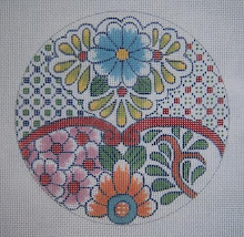
The arrow pointing to the little square at the bottom is only to show where I centered the diaper pattern.

There is a light blue outline around some of the pattern - the red flower at the top - but unfortunately, the DecoColor pens I have recently come to really enjoy, don't come in the right color - This is unfortunate about these wonderful paint pens, as it really would save a lot of time in outlining, etc. Sooooo I had to do as always, and use a brush and paint for the outline.
I painted this Zebra skin mini-stocking today, and it was a big relief to just get out a green DecoColor pen to mark the dots as a guide for the "lace trim" I use here. Before paint pens, I had to, again, use a bottle of paint and a brush - This was much faster, and looks fine. I used the DecoColor fine point for this one, rather than ultra fine.

A word about these pens - I usually try out everything myself to make SURE it is totally safe on needlepoint canvas, but a good friend whose work I admire greatly, told me about them. She has marketed nationally for a number of years, so I trust her judgment. She uses them to actually paint some of her very simple (but wonderful and effective) small canvases, as they cover beautifully, whereas the Sharpie pens don't. I can't use them a lot, as most of my colors have to be mixed. Pity. However, they do solve a lot of problems for me.

There are different pens for different phases of putting a design onto canvas or marking - so it isn't just a matter of choosing an array of pens. One must be sure of what they'll be used for, as they perform differently. An example is here - another of my new designs. I decided to stitch this one, but rarely bother to take the time to paint it for myself. Besides, I enjoy watching it come to life on a white canvas with colored threads.
On this one, I intend to use the Kreinik #032 braid, which is a white metallic, and was afraid the black ink might show through - so I used a light blue Sharpie ultra fine point pen to draw this fretwork. Also, it saves the confusion of the line being up against the line of the leaf.
On the painted version, it was just soooo easy to paint the area in solid blue (with brush and paint) and then draw the fretwork on with the WHITE DecoColor pen. (fine point) This works better and faster for this process than paint and brush! Previously, I would have painted the area blue, then drawn the fretwork with the black pen, and painted over it with brush and white paint. An improvement!!!!
Also I was thrilled to find this pen, as it's the only one I've tried that really works well on black canvas for drawing (I use ultra fine for drawing) There is one I tried first that wants to "puddle" now and then - that is, paint dribbles down the point and makes a blob on the canvas. Aggravating!
Incidentally, these pens are also dry-clean proof, which is a consideration especially for larger pieces. Just being waterproof for wet blocking isn't enough. If the ink isn't permanent against dry cleaning fluid, the lines can lift to the top of the work and totally ruin it - I've seen this happen several times, and it's a tragedy.

Monday, September 7, 2009

New Tutorials!

No picture this morning, as I haven't had enough coffee yet. I have been thinking recently about doing some tutorials in designing your own projects and "how to's" rather than just patterns to copy - it might be of more use.

Several things prompted this move: One is the questions I get via comments, as I have no way to reply to them. These come to my e-mail via "no-reply" mail, so I can't answer them. (My e-mail address is clearly seen on my profile - just go to "About Me" on the side bar and click on "my profile" down at the bottom.) I truly enjoy answering questions and helping any way I can - sharing my 40 years of experience in designing and marketing hand painted needlepoint canvases, along with teaching and writing about it.

Another prompt is an article I have seen in the last few days about drawing pens in a nationally distributed needlepoint publication - (I get an advance copy of this.) The information is misleading, and almost ludicrous, and it frightens me that someone would be put off from an otherwise enjoyable hobby by faulty information leading to a bad experience.

This also holds true in several different books, articles and blogs on drawing and painting needlepoint canvases. Often the people who write these apparently have little or no knowledge in this arena. Nothing works so well as years of trial and error, experience, and plain old common sense!! As Michaelangelo said in his old age: "I am still learning." It needn't be as complicated or mysterious as people are telling., and is actually a simple and inexpensive way to create your own needlepoint projects. (and thereby saving money to buy wonderful threads and beads, etc.)

Anyway, I received a question about belts - but I have no idea what kind of belt, for whom, what style, male or female, child or adult - what? Sooooo I decided the best thing to do is to start with a mini-tutorial on painting your own canvas as a "point of departure." Later, though, as it will take a little while to get it together.

As for the belts - these are lots of fun, and I have taught a number of people to do their own, as it's more creative and fun to do one's own, and also saves the price of a commercial designer. I have one friend who has done plaids, camouflage, Pucci patterns, Nautical flags, monograms and names, - all kinds of things. She even did collars for all the family dogs.

For a beginning tip, there is a tutorial on an edge stitch (long-armed cross stitch) for belts and other small things under "stitching" on the side bar - down at the bottom of the page. Also, the canvas preparation for the napkin rings is basically the same - the belt just needs to be long, in the required measurement. One must consult a finisher for this, as I don't know how much has to be allowed for that. The 1 1/2" wide is pretty standard for belts, as they must fit inside belt loops on the garment.

Monday, August 31, 2009

Crazy for September

It won't be September until tomorrow, but after a dry, sweltering summer (again) in Austin, we all look forward to, hopefully, the time when at least at night it starts to cool off a bit.

Anyway, the header is constructed from my "A Heart for Birthdays" series of crazy quilt designs. September is about Sapphires and Asters and beautiful cooler colors than last month.
If you haven't seen the CQ for birthdays things, they are on the other blog, and are quite an exercise in silk ribbon embellishing and "beads on the painted canvas."

Saturday, August 29, 2009

For Halloween Decor

Playing with little Halloween motifs again - this time a bat and a witch. My thought, of course, was still for table settings and napkin rings, but Pat Miller, over at Needleartnut blog, suggested putting the little circles of my napkin rings onto larger circles, or even on diamond shapes, for ornaments on dowel sticks to make decorative and festive centerpieces. Pat is stitching my Jolly Roger pieces - so do go there and take a look, as her stitching is imaginative and thread choices are lots of fun!

I had also thought about stitching more circular background around them (even bargello) and making kissing balls to hang or to just sit on the dining table and on side tables for the "season."

Anyway, I have already given you a tutorial on drawing circles onto canvas - you can find these under the label "canvas preparation." This first circle is 3 1/8" diameter, and is good for inserting the smaller one (the moon) to make a small ornament. Actually, 3 1/2" would be better, but I can't find my drawing, and I'm too lazy right now to do another.
The second scan is the small circle, 2 3/8" diameter, that I use for the "moon" on the napkin rings. To insert it into the larger circle, draw the big one FIRST, mark the centers lightly, and then count up 21 threads from the horizontal center and make a mark to begin the top of the smaller circle. These center marks can be easily dotted out with white acrylic paint.
And now the new motifs! I had to give the bat green eyes, and the witch has a silver hat band and an orange scarf. I had intended just a black silhouette against the yellow/orange moon, but couldn't resist a bit of color here.
Enjoy! - and see what you can come up with for further decoration.


Thursday, August 27, 2009

Spook Season: The Jolie Rouge

I finally got this one done - the red version, which is thought to be the oldest form and the origin of the name "Jolly Roger." This was supposed to signify BLOOD and the fearsome things the pirates would do if the ship under attack didn't comply and "surrender the booty." The name means, in French, "pretty red."

Working now on a bat and a witch. These are on 18 mesh canvas for needlepoint - but could also be worked on the same count Aida for counted X-stitch.

Sunday, August 9, 2009

Halloween Time! Motifs for Projects in Needlepoint (or X-stitch)

I've neglected Freebies for a few weeks due to being incredibly busy - but this has been brewing in the back of my mind for quite a while. Today I needed a break, so have played on canvas all day, and think these might be fun.

First, my proudest achievement - the emblem from the Jolly Roger! I used a white Deco Color Paint Pen, fine point, to draw it on black canvas, which is what it needs. I'm thinking the canvas could be stitched with something open with a bit of sparkle in it, and would probably do the skull and crossbones in DMC Satin Floss for the high shine.

I'm showing the drawing on white canvas, as it would be easier to use as a guide for drawing your own, I think.

Next, the cat. This is a black cat against a moon - I didn't have time to paint them, but I think it's actually easier to work from the pictures of just the drawing. I thought to put the fence all the way across, which I'll probably do if I ever have time to stitch the full set.


As napkin rings in previous posts demonstrate, these should be 5 1/2" long, so you can simply mark the top and bottom lines across the canvas from the center - 2 3/4" each way. The band is just under 2" high, which is a little wider than my usual, which is 1 1/2".This cat, of course, should be solid black with a green beads placed for it's eye.

The moon would be a soft yellow, and the background maybe dark blue with a few silver or Kreinik #032 braid stars (dots) sprinkled around.

The spider is hanging from a silk thread, which I'll make with Kreinik silver braid on the warp (bump) stitches, and a bead on each of the weft stitches in between. I think the web might be fine in DMC Satin Floss in light grey or something of that sort. The spider definitely needs green beads for her eyes.


I did run these critters by the grandchildren to make sure they're identifiable, and they met with high approval and shouts of glee.

Last, the pumpkin. I didn't have time today to make it into a napkin ring, but it would fit well in this shape if the leaf on the left is eliminated. My thought with doing it on a small circle is that a larger circle could be worked around it, and maybe filled in with bargello - even 4-way.

As for threads for this, there is a Petite Very Velvet that is absolutely perfect for the pumpkin, with the outline done in a darker orange DMC floss!. I'll do the leaves, if I have time to do this one, with Satin Floss for the shine. The cut-outs on the face will be stitched with YLI black Shimmer Blend ribbon floss. Great effect with different textures!

Another way to use these motifs would be to put them on flatware holders. These look rather like large scissors cases, or what I've seen some designers do as "door tassels." About 5" high by 3" wide at the top. Great seasonal table decoration!

The round ornament could be finished on a styrofoam ball and sit on a festive table (with hat pins in the bottom) for a centerpiece.

If you haven't printed out these as patterns for your own use before, the easiest way I've found is to click on the image to enlarge, then click on "file" and "print preview." It will print out large enough to see easily and then you can draw it onto canvas. Experiment with different threads, etc. and have fun with your own creativity!

Wednesday, July 15, 2009

Graph Paper

Just a quick word about Graph Paper! I see a lot of people "Googling" graph paper. I have a wonderful site I've gone to for several years, where I can custom design my own graph paper - to the size squares per inch I need.

Also, there is a feature where one can go to uneven size and print out graph paper for knitting design patterns. For knitting, as some of you know already, it's asymmetric in that the squares have to be wider than tall. It's a simple process.

Anyway, for your custom graph paper needs, go to Incompetech and design and print out your own. For asymmetric graph paper for knitting patterns go to THIS LINK.

Sunday, July 12, 2009

An Ornament with Beads

This is a piece that is offered in a previous post under "Ornaments" on the side bar. I wanted to show how very different the same design can look when stitched with entirely different materials.
The progress in stitching is being presented on the other blog, so do go see it: Possibilities, Etc.

Wednesday, July 8, 2009

Back to Halloween: Napkin Rings Painted


I spent most of yesterday painting these napkin rings, and now am ready to stitch one or two. You already have the drawn pattern, so here is what they look like painted. ("jeweled" ones included)

I had called Colleen, owner of the LNS here in Austin, to see if she could find me something wonderful in "pumpkin" color - and she sent me the PVV in a perfect orange - so that decision is made (This arrived, of course, overnight).
I'll stitch the dividing lines - the grooves and cutting mark at the top, in darker orange cotton floss, and the black features probably in DMC Satin Floss, as it shines, and will be a nice contrast to the velvet of the orange thread. The lines around each pumpkin will be Kreinik 002V #12 braid, and the background some kind of upright stitches in sparkly black and whatever else I can find that's suitable.

I can't decide what to do about the backgrounds of the little pumpkin designs, but am thinking dark green silk. I'll wait on that until the rest of it is done. The candy corn will probably be best stitched with DMC Satin Floss to make it shine, with something sparkly on the black backgrounds. The main background I'm not sure yet - but will probably, again, use a long upright stitch resembling bargello and using maybe Petite Frosty Rays in black, orange - whatever I can find in my stash that looks right.

The next project is to add a bat, a witch, a spider, and whatever other motifs I can fit properly into that tiny space. Also, if you want to make bracelets - elongate the piece to the required length for you.

I also painted the jeweled napkin rings, and they really came to life by the time I put the gold on them. I'll use beads for the jewels except for the pearls, as they are prettiest in Renaissance white Shimmer. I think the emeralds with diamonds is my favorite, and so appropriate for my older daughter.

The jewels could, of course, be painted a different color for different jewels, with appropriately colored backgrounds. I thought about each jewel I'm familiar with, and each suggests a typical shape one usually finds in the cuts.

A gift of someone's birthday jewels in a set of napkin rings would be fun! - or even a set of them for a family with the birthday jewel for each member.
The string of pearls is pretty on the soft, Caribbean colors, but would also be lovely on shades of pink/coral! Garnets just had to be on a "lavolier" looking antique necklace effect - and peridots would also work well this way.
I have already posted the patterns for these jeweled pieces, and this is what they look like in color!!
Now to stitch a few for gifts. They are small and quickly done, and one could carry them in a purse on a trip.